Freelance | Illustrator, Photoshop, InDesign | 2025
Travessia
The branding for Travessia captures the essence of exploration and cultural immersion, aligning with its mission to create personalized, meaningful travel experiences. The visual identity focuses on storytelling through clean layouts and natural, organic design elements that evoke a sense of adventure and authenticity.
Position Travessia as a boutique travel agency recognized for exclusivity, trust, and personalized service in the travel market.
Objectives
Design unique, memorable journeys that blend luxury, authenticity, and attention to detail, exceeding client expectations through tailored service.
Build strong, long-term client relationships, ensuring high satisfaction and referrals that drive organic growth.
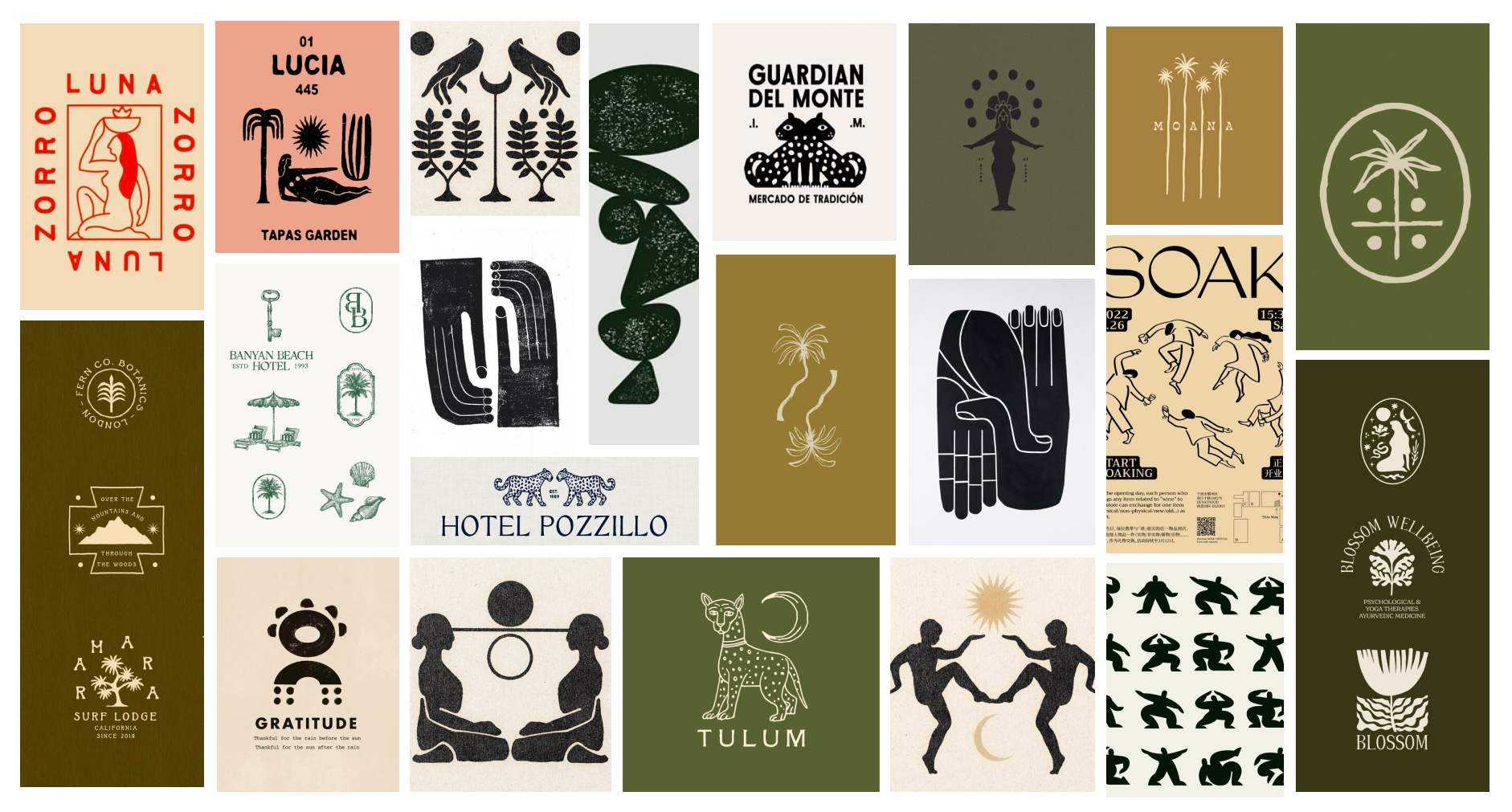
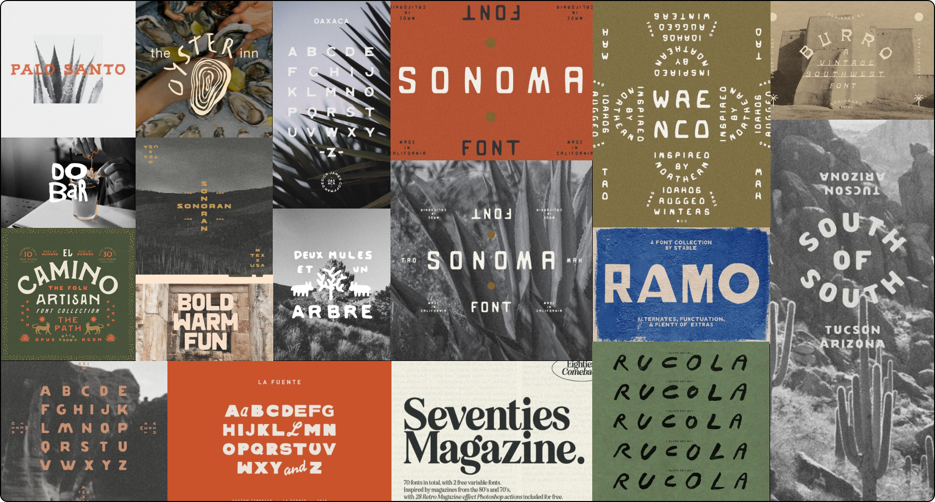
Moodboards
-
Proposal 1
This proposal feels elegant and mystical. It is inspired by the Mayan goddess Ixchel, protector of navigators and travelers by sea, as water symbolized her power.
The arch behind the figure represents openness to new experiences and adventures, while referencing classical architecture to evoke a sense of history and tradition. The floating compass above her hands symbolizes guidance and exploration, directly connected to travel.
The minimal facial details create universality, allowing anyone to see themselves reflected in the figure. The simplicity of the design makes the logo versatile and refined, while its symbolism adds depth and personal meaning.
-

Proposal 2
This concept connects Travessia with ancient cultures. The pyramid serves as a universal symbol of wisdom, spiritual connection, and cultural legacy. The inverted triangle with a circle at the base is inspired by a compass, while the surrounding maguey leaves — a plant native to Mexico, symbolize life and a deep connection to the earth.
The double “s” placed over a horizontal line plays a key typographic role, visually dividing the name into trave and ssia to improve readability. This detail also adds a distinctive aesthetic element, making the name more memorable and instantly recognizable.
Through these elements, Travessia grounds its identity in nature and Mexican roots, reinforcing its promise of authentic and meaningful travel experiences.
-
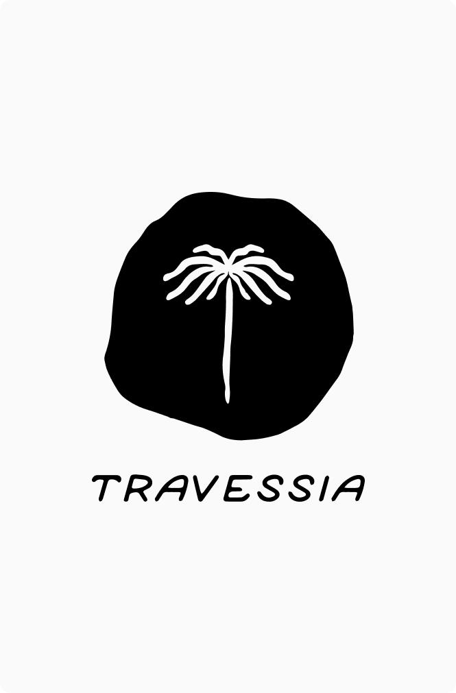
Proposal 3
This proposal is more abstract and concise. The central element is a palm tree set within an organic, irregular shape. The palm symbolizes exotic destinations, relaxation, and adventure, making it a natural fit for the agency.
The imperfect circular background reinforces a handcrafted, organic feel. The typography remains consistent with the previous proposal, featuring subtle organic details that highlight the brand’s authenticity.
While the irregular form and simplified palm suggest an artisanal approach, the overall composition stays clean and minimal, creating a refined balance between craftsmanship and exclusivity.

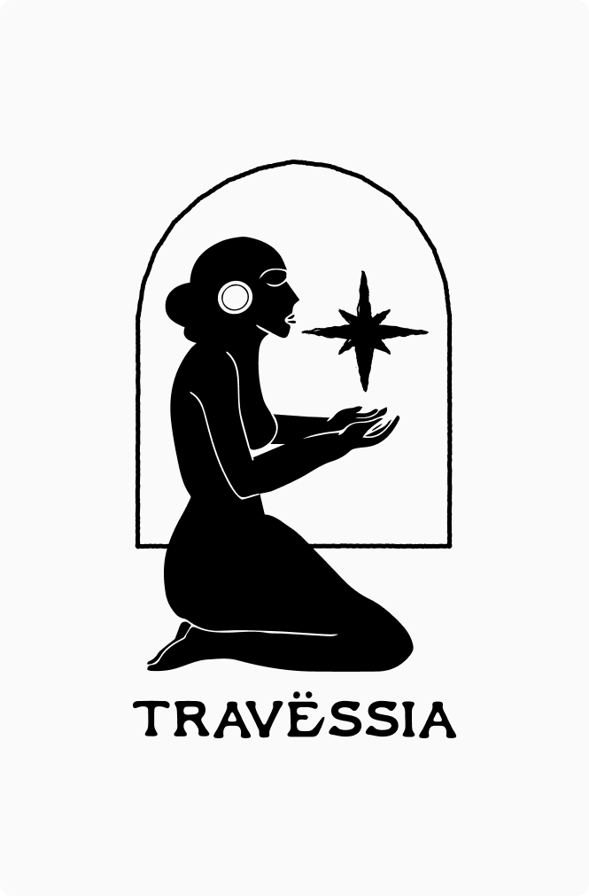
From the previous options, the clients strongly connected with Proposal 1 and decided to explore a more abstract version of the female figure, focusing only on the hands and the compass.
I also incorporated the imperfect circular background from Proposal 3 to reinforce the handcrafted, organic feel they wanted to express.
The final design features two hands representing support and human connection, with a compass at the center symbolizing direction, adventure, and purpose. Together, these elements reflect Travessia’s essence as a boutique travel agency that offers more than trips, delivering meaningful experiences and personalized guidance.
The primary logo was designed to visually capture the brand’s core values: human connection, guidance, and exploration. The creative process was driven by the idea of a journey, not only physical travel, but also the emotional and personal transformation that comes with it.

Personalized wine label for souvenir travel gift abstracting the star of the logo to make it feel more sophisticated, clean and elegant.
The palette is rooted in earthy greens and soft neutrals, reflecting nature, authenticity, and understated luxury.
Dark Olive Green serves as the primary brand color. It conveys elegance, trust, and exclusivity while maintaining a strong connection to nature. Its depth communicates authority and professionalism, positioning Travessia as a refined boutique agency.
Soft Olive Green adds warmth and approachability. It reinforces the organic feel of the brand while bringing balance and subtle freshness to the visual system.
Light Sand acts as a neutral foundation. Inspired by natural landscapes, it provides calm and sophistication, allowing the deeper tones to stand out while maintaining a clean, premium aesthetic.
Together, the palette expresses conscious luxury, warmth, and a deep connection to meaningful travel experiences.

This Instagram feed for Travessia, was designed to evoke a sense of adventure, elegance and connection with nature. The visual style features the curated color palette of earthy tones chosen for travessia, including warm terracotta, sage green and beige, which reflects the brand's connection to natural landscapes and cultural experiences.
The layout balances immersive travel photography with informational posts and travel tips, creating a dynamic and engaging flow. Each post is thoughtfully designed with clean typography and ample negative space to maintain a minimalist, modern aesthetic. The use of overlays and frames enhances the storytelling while keeping the focus on the visual journey. This design invites users to explore the world with Travessia.

The design of this welcome card for Travessia focuses on creating a visually soothing and elegant experience that aligns with the brand’s philosophy. The minimalist layout ensures a clean, uncluttered look, while the ample white space draws attention to the message, enhancing readability and also using subtle font variations to create a natural hierarchy that guides the viewer’s eye.
The choice of a black-and-white photo was intentional to evoke timelessness and simplicity. Taking away distractions, allowing the viewer to focus on the subject’s texture, shape, and emotion adding visual interest without overpowering the design also bringing a sense of sophistication and nostalgia.