Latino Network
Visual Communications Coordinator | Photoshop, Illustrator, InDesign | 2024 - 2025
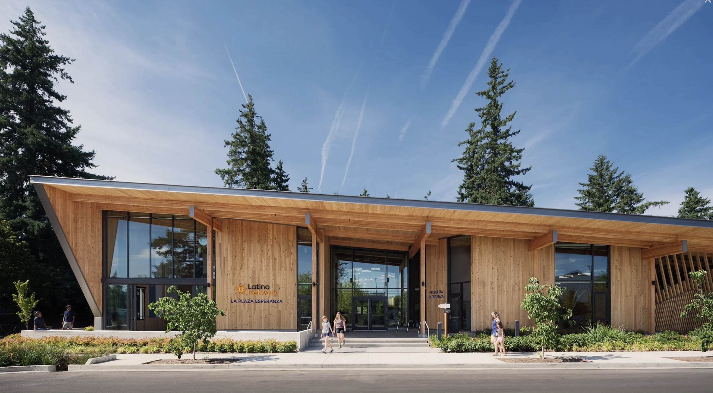
I led the creative direction and visual design for community programs, events and organizational communications for a nonprofit dedicated to empowering Latinx communities across Oregon. I supported teams in creating both digital and print material, ensuring visual consistency, multilingual accessibility, and alignment with the brand’s new direction.
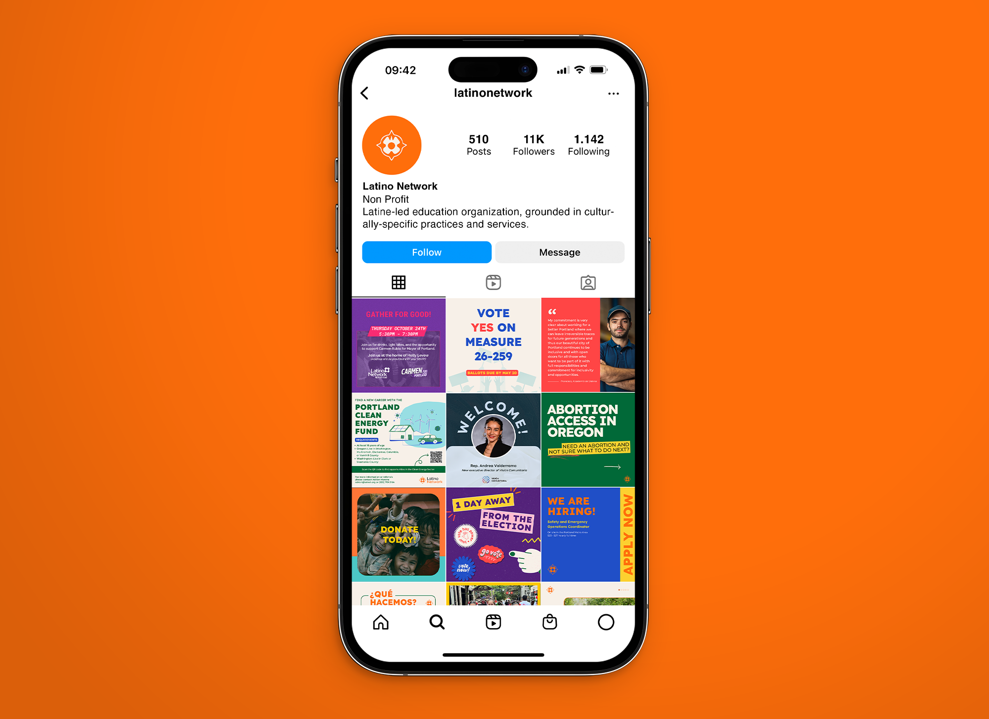
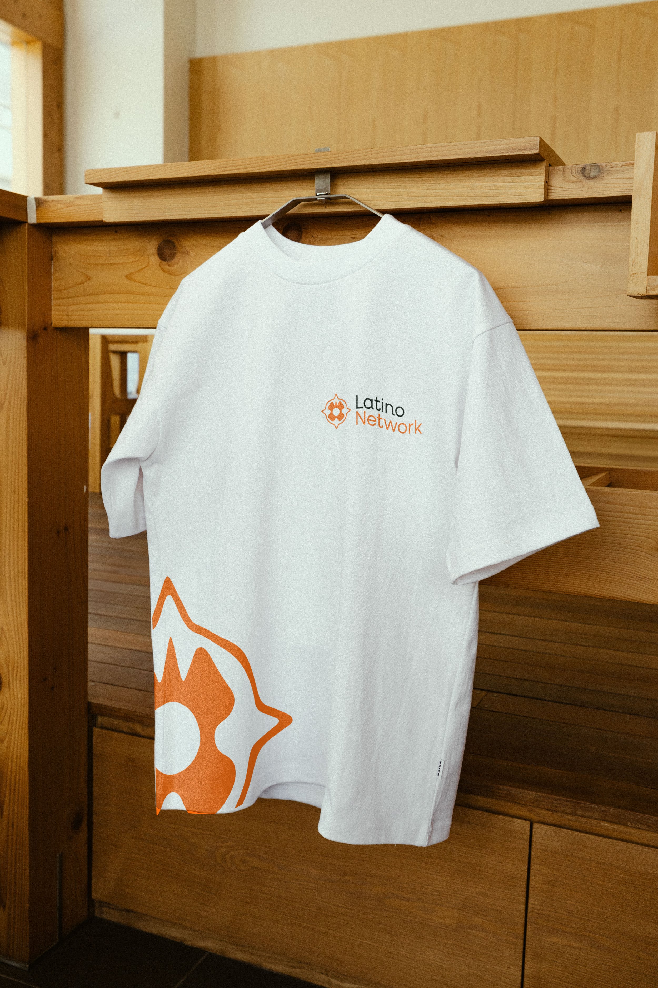
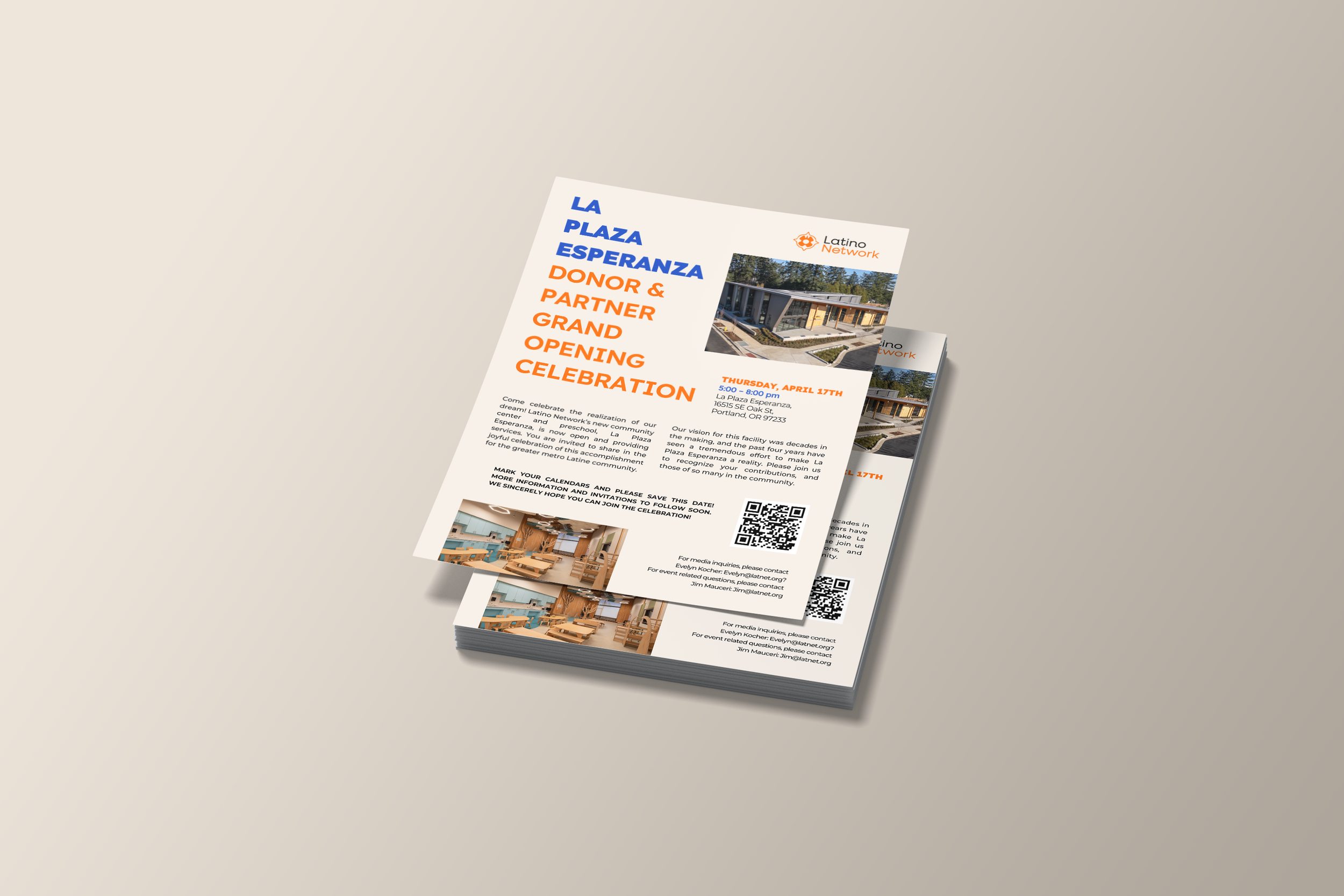
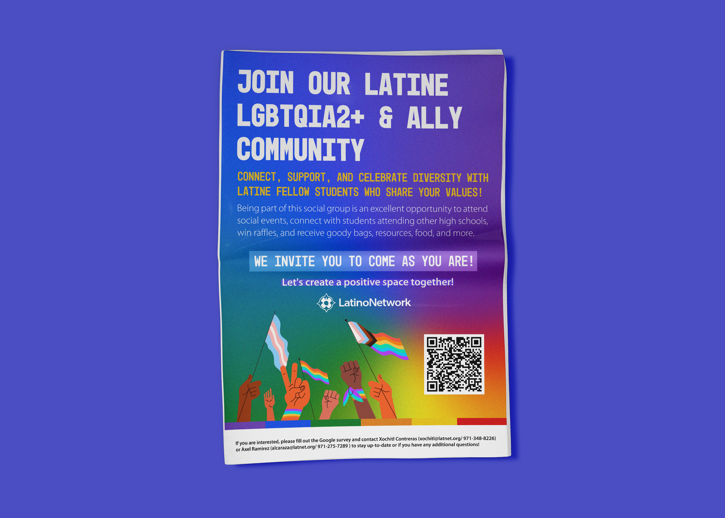
I cultivated visual consistency while enhancing the brand presence of an organization doing vital work for Latinx communities in Oregon, making sure it’s correct usage in all different platforms, I worked from the rebranding and crafting design in social media, brochures, important documents that help out community, flyers, logos, to taking photography in events and keeping consistency across media.
In this rebranding proposal, I tried to create an impactful identity that speaks straight to the hearts of supporters, volunteers and everyone else in the community. In this version, I proposed a new rounded typeface for the name, injecting a sense of warmth and approachability into the organization communications.
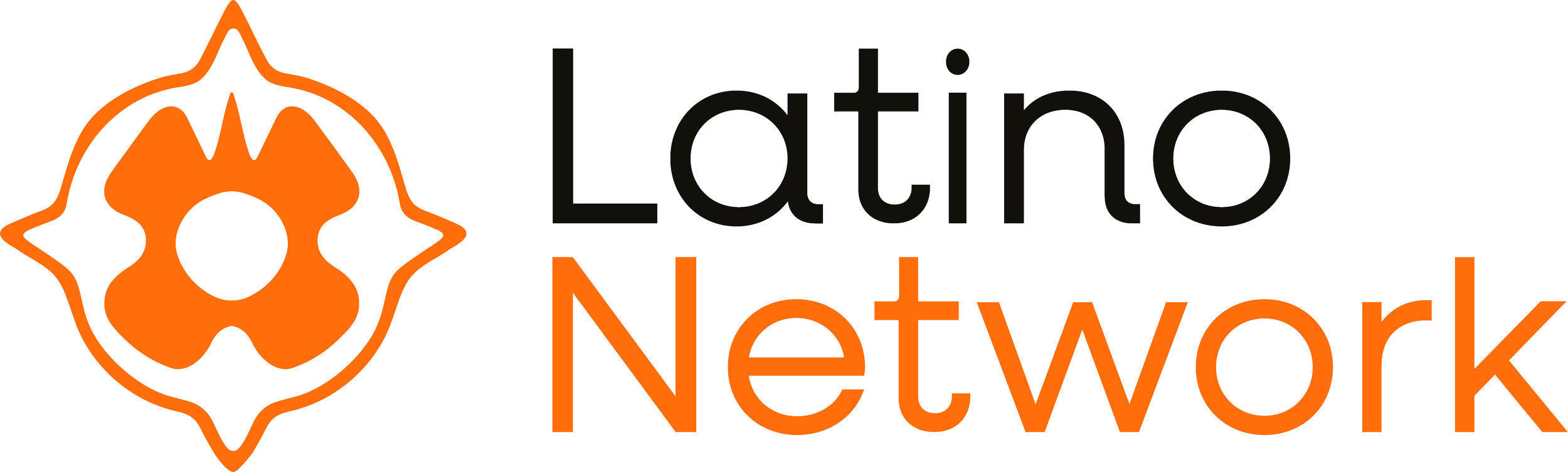
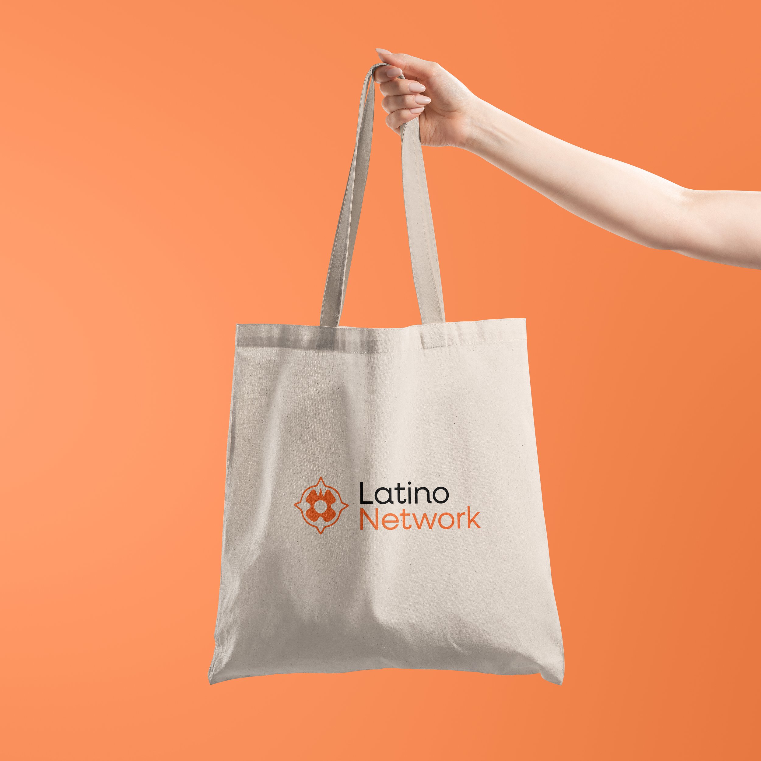
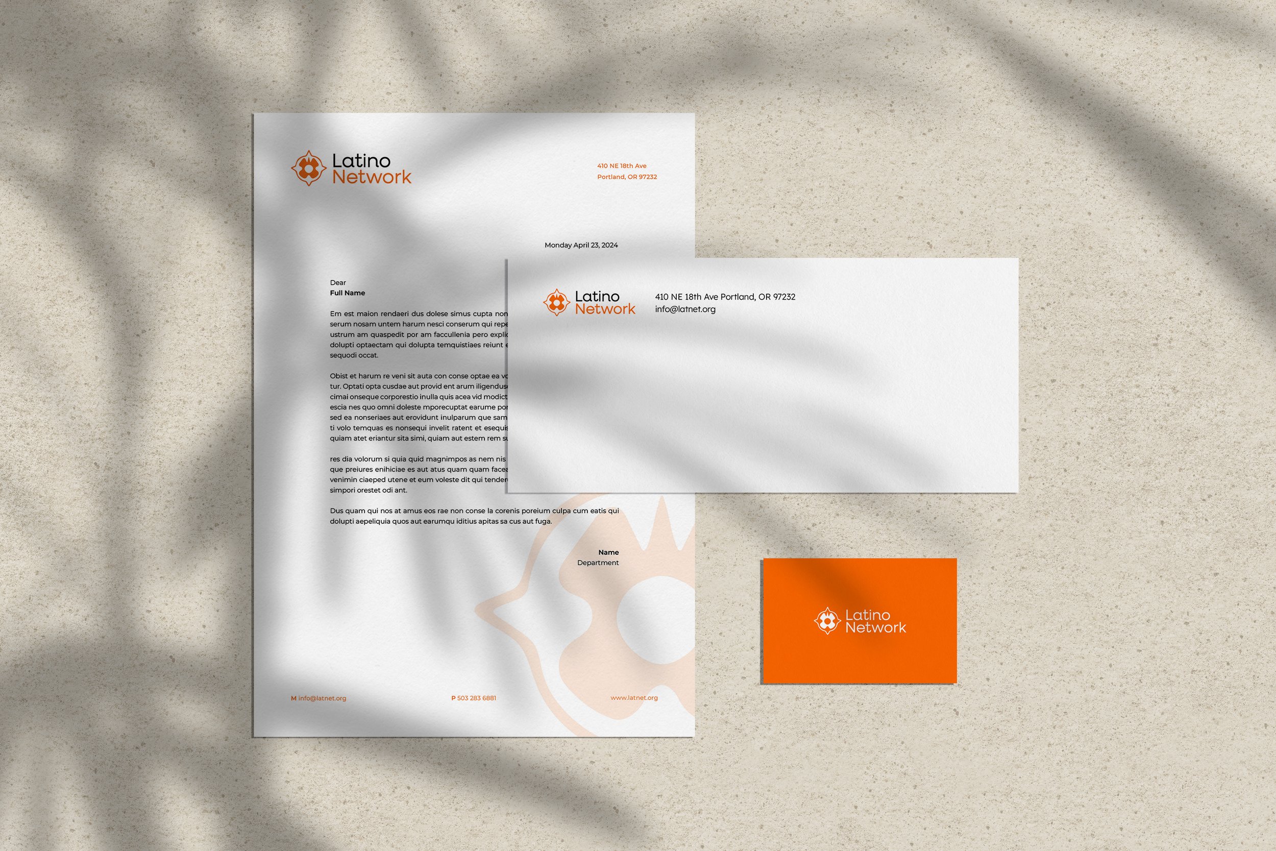
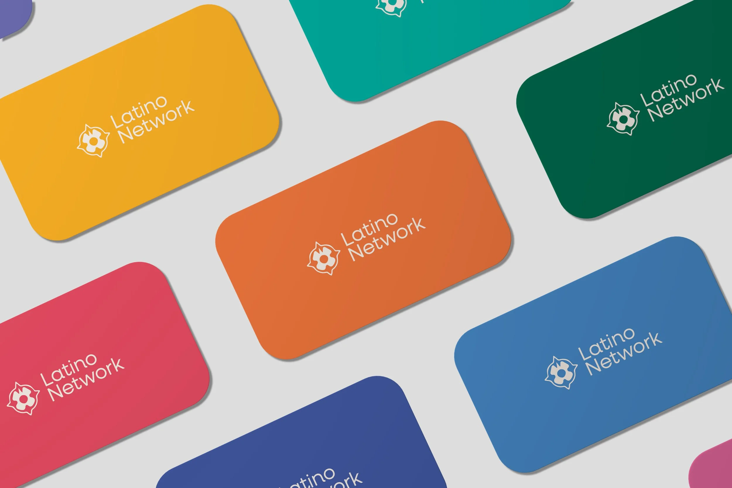
The updated lockup, places the name alongside the symbol, creating a more cohesive and horizontally oriented composition. This adjustment improves legibility and establishes a clearer visual hierarchy, allowing both elements to work together more seamlessly as a unified mark, this configuration significantly increases flexibility across different design applications.
This change not only modernizes the appearance but also reflects their commitment to staying connected with their audience in a friendly and inviting manner.
Before
After
My objective was crafting a new visual identity system and brand guidelines that reflected both the organization’s cultural roots and its evolving political voice.
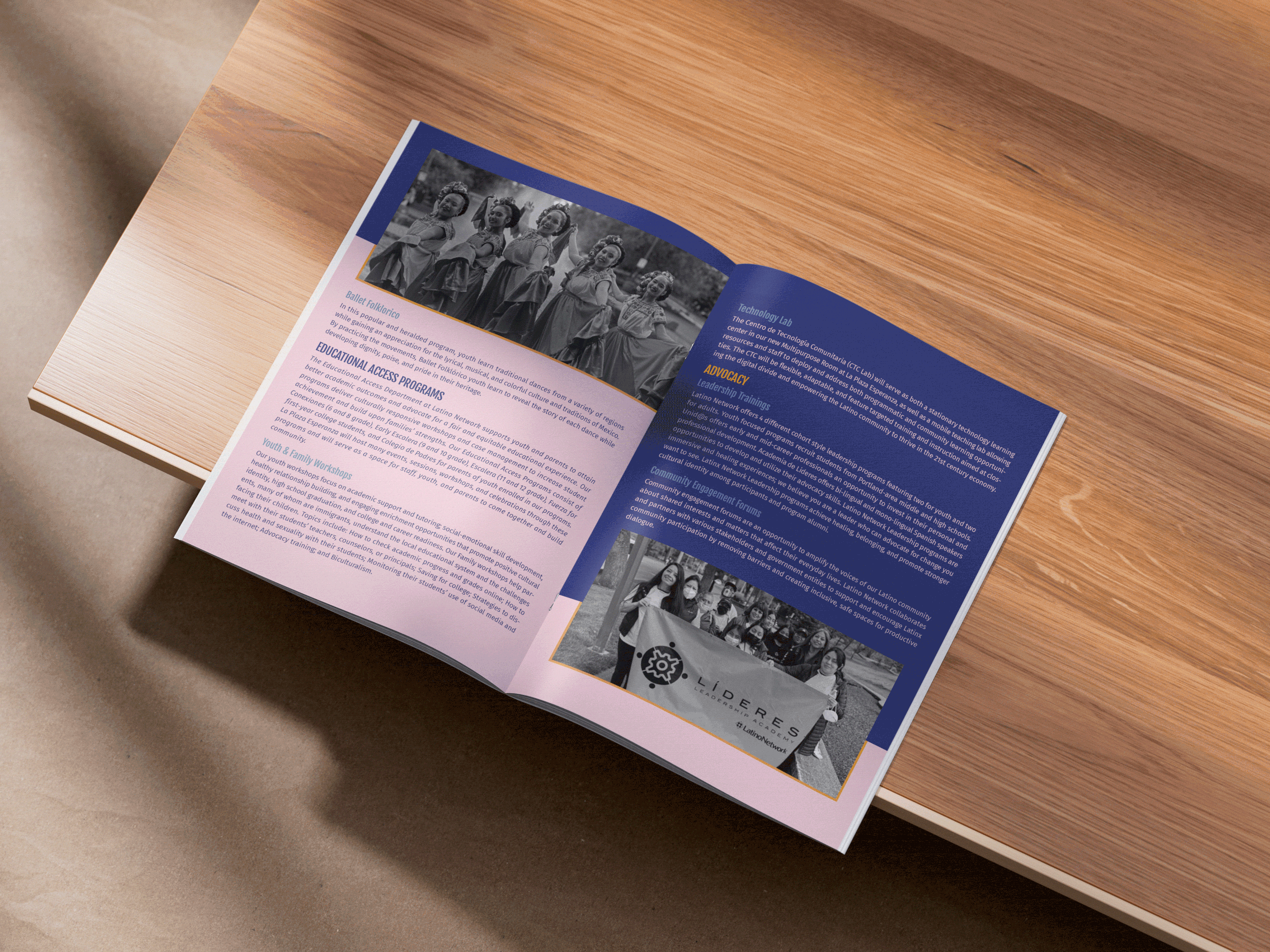
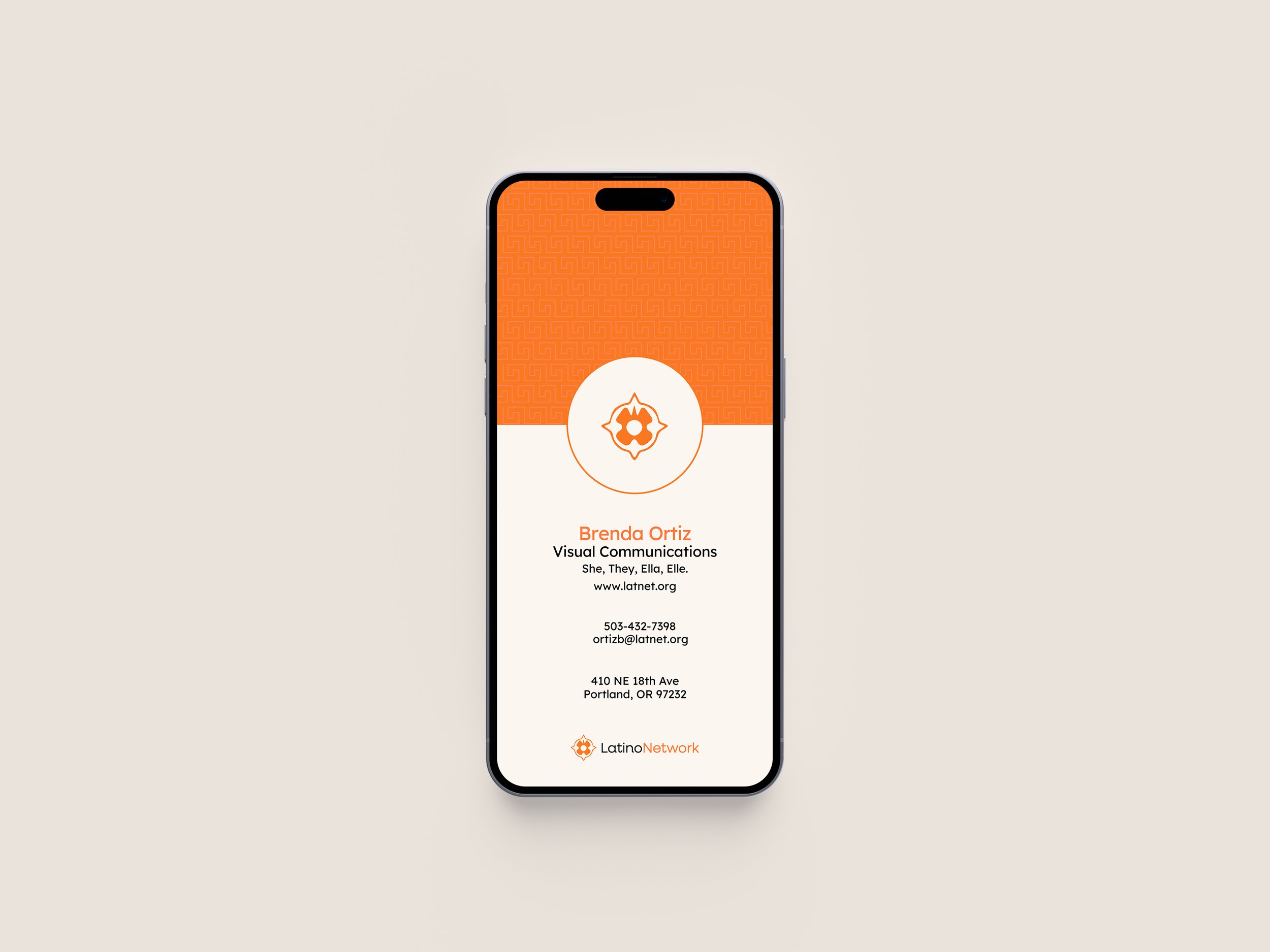
Creating a flexible design system used across digital, print, and environmental applications, this included strategic design decisions across typography, color systems, and visual language that could adapt to the needs of diverse audiences and platforms.
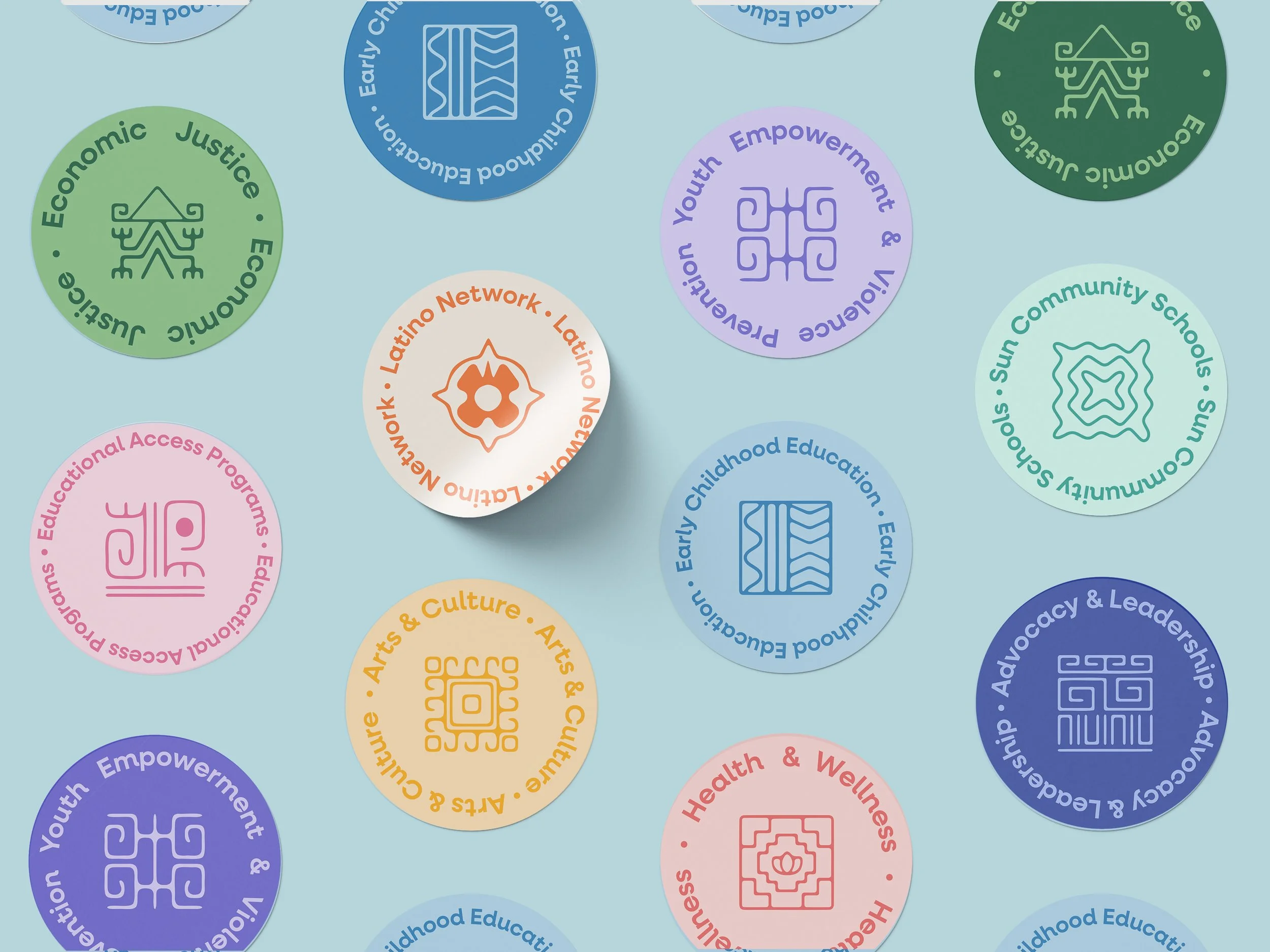
Inspired by symbols, textiles and objects of ancient prehispanic cultures, such as Inca, Guarani, Quechua, Azteca, Mapuche and more. I’ve crafted a logo for each one of the 8 programs that are part of the Latino Network family, each adorned with a distinct monochrome color palette. These logos not only serve to differentiate each program but also resonate deeply with the diverse heritage that Latino Network represent, fostering a sense of cultural pride and connection in every communication.


Beyond the core rebrand, I led the creation of several new brand identities for other initiatives under the Latino Network umbrella:
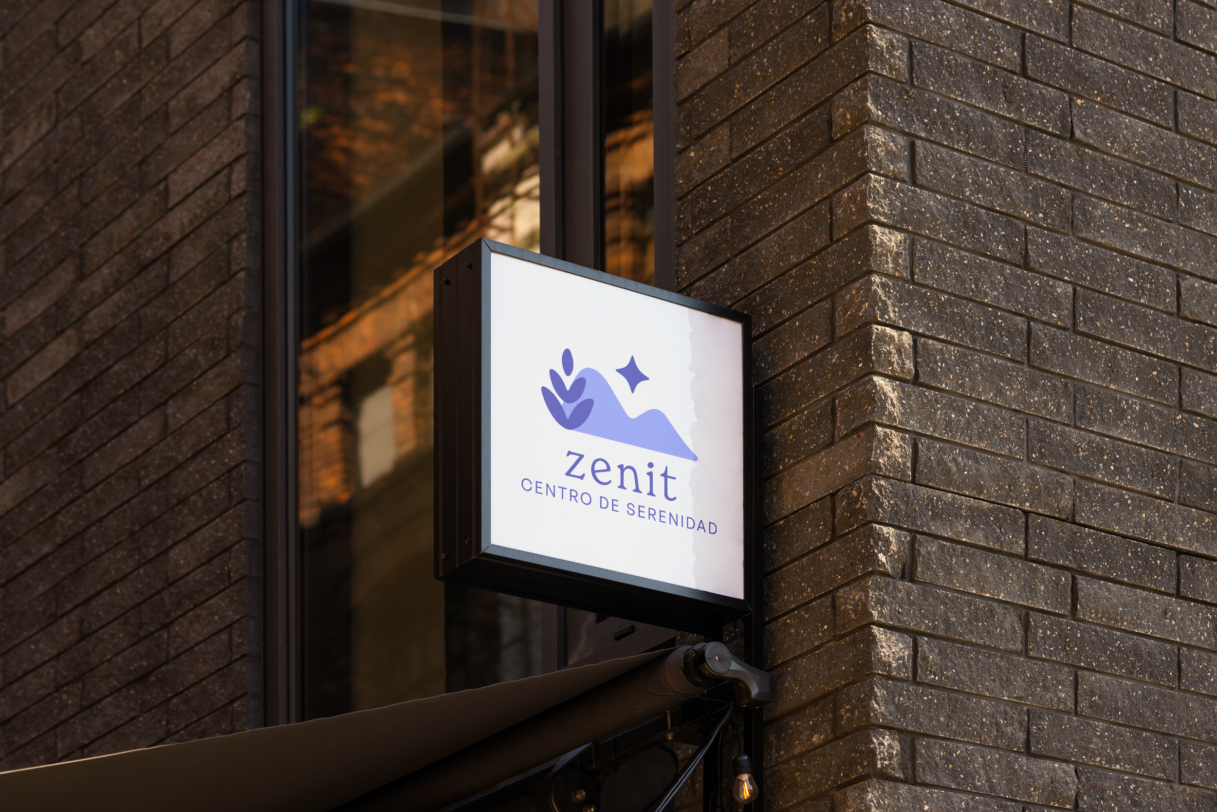
Zenit, a new mental health clinic, part of Latino Network. I developed their logo centered on care, healing and protection. The mountains refers to Portland's natural geography, Mount Hood and the Cascades, & also can be refer for Latin American landscapes like the Andes and Sierra Madre. They embody the emotional terrain of healing, where the path might be challenging, but always leads toward clarity and strength. The smooth lines suggest a gentle and soft approach, honoring the pace and process of each individual.
The lavender-inspired petals honor Latino traditions, where lavender is cherished for its calming and spiritual properties, used also in the color and the star symbolizes a guiding light, leading individuals through their mental health journey with hope and clarity.
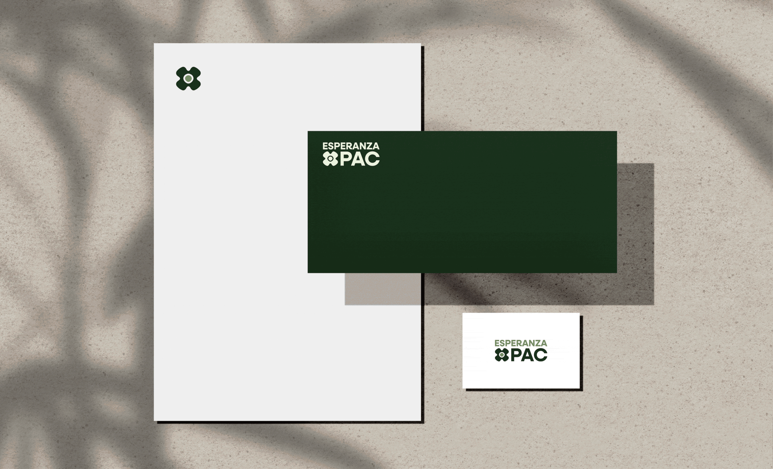
Esperanza PAC was created to support progressive and also BIPOC candidates and ballot measures that support the community's issues such as education, health and wellness, economic development, and representative democracy.
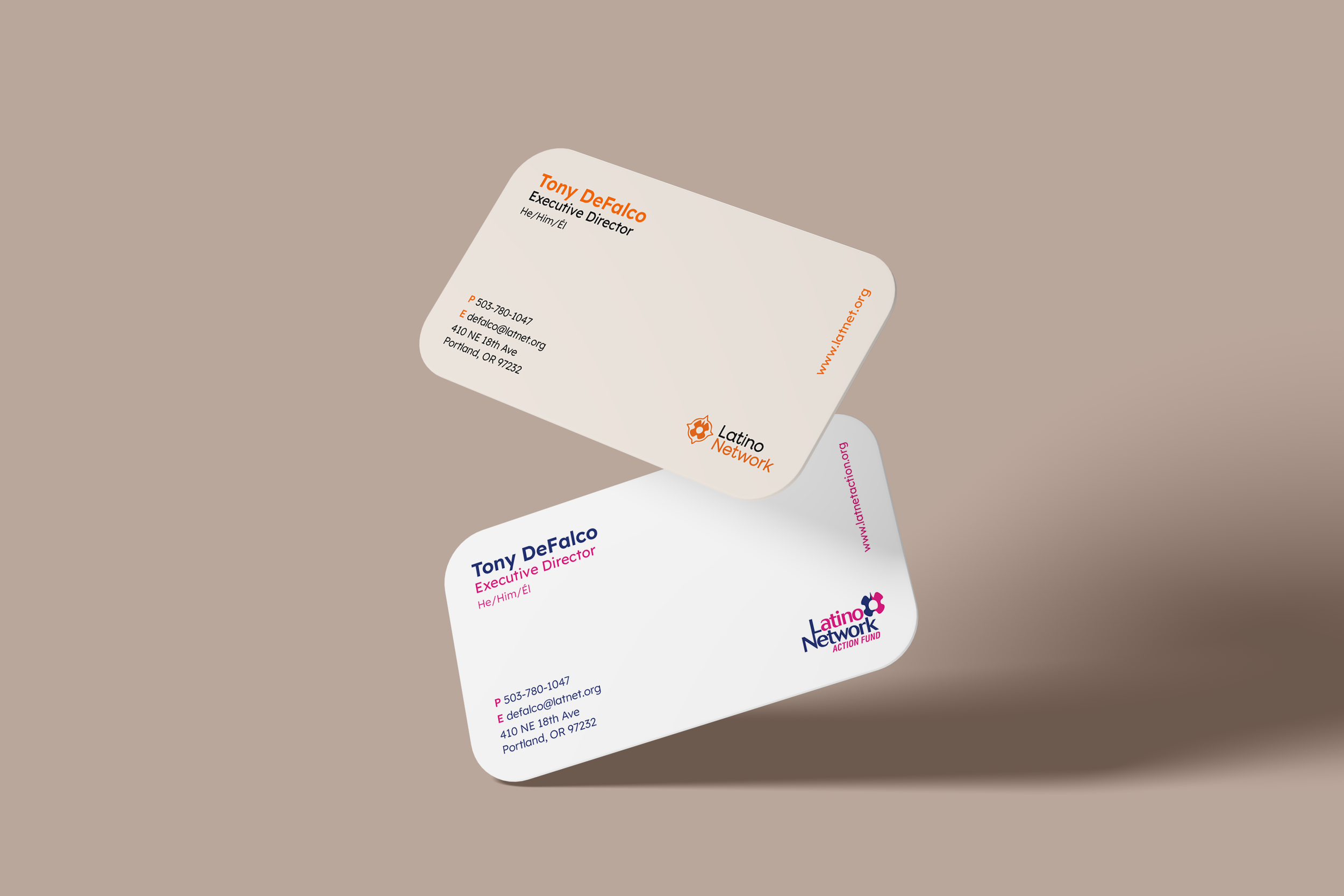
The core visual element across LN and LNAF is the Ollin, representing movement, action, and transformation. By using the Ollin consistently, the logo maintains strong brand cohesion while allowing each entity to differentiate itself within the ecosystem of Latino Network organizations.
Using capital letters for Esperanza PAC enhances the political weight and authority of the brand, making it feel more decisive and action-oriented. It also aligns with traditional PAC and political organization branding, which often relies on uppercase text for impact. Additionally, keeping the same font as Latino Network and Latino Network Action Fund ensures brand consistency, maintaining a strong visual connection across all entities.