Sauce Estudio
For this project, I was tasked with creating the whole brand identity and naming for Sauce Estudio, an interior design studio with a modern yet natural approach. The goal was to develop a visual identity that reflects the studio’s organic design philosophy while maintaining a sense of professionalism and timelessness.
From the selection of a soothing yet earthy color palette to a minimalist logo that echoes the grace and resilience of the willow tree, the branding was designed to appeal to clients seeking elegant, nature-inspired interiors. The process included naming, logo design, slogan, typography selection, color and the creation of cohesive brand guidelines to ensure Sauce Estudio’s vision is clearly communicated across all platforms.
Freelance | Illustrator, Photoshop, InDesign | 2024
Naming
Following a series of discovery meetings and a detailed briefing questionnaire, I developed a clear understanding of the client’s vision and how they wanted to position themselves publicly. I guided them through defining their mission, values, and brand name, helping translate their abstract ideas into a cohesive foundation.
The brand aimed to evoke nature, softness, minimalism, and understated elegance, inspired by a wabi-sabi sensibility. From this direction, I began exploring name concepts rooted in natural materials, construction techniques, and organic elements.
Several name directions were explored, each rooted in nature, craftsmanship, and organic design principles:
Mujo: A Japanese concept meaning impermanence. It reflects an appreciation for change and the evolving nature of life and space.
Lu’um: “Earth” in Mayan. A direct connection to land, materiality, and sustainability.
Cob: A natural building technique using earth, straw, and water. Suggests an organic, hands-on design philosophy.
Balsa – Arce – Teca – Ocre – Sauce — Inspired by wood types and natural tones, reinforcing warmth, materiality, and a connection to nature.
Espacio Abierto — Evokes openness, light, airflow, and spatial harmony.
Nomi — A Japanese woodworking chisel. Represents craftsmanship, precision, and artisanal excellence.
Sauce was ultimately selected for its balance of softness and strength. The name feels organic, elegant, and grounded, while remaining memorable. Strategically, it offers strong visual and conceptual flexibility, allowing the brand to build a narrative around fluidity, resilience, and natural movement. Its simplicity aligns seamlessly with the minimalist, wabi-sabi–inspired foundation of the brand.
Sauce was chosen as it symbolizes a type of tree closely connected to nature and serenity, embodying the harmony between organic materials and the natural environment.
Wood, a central element in the name, represents this intimate relationship with nature and organic elements. By integrating these concepts, the name Sauce reflects not only the beauty and resilience of wood but also the creation of serene and balanced atmospheres, perfectly aligned with the studio’s design philosophy.
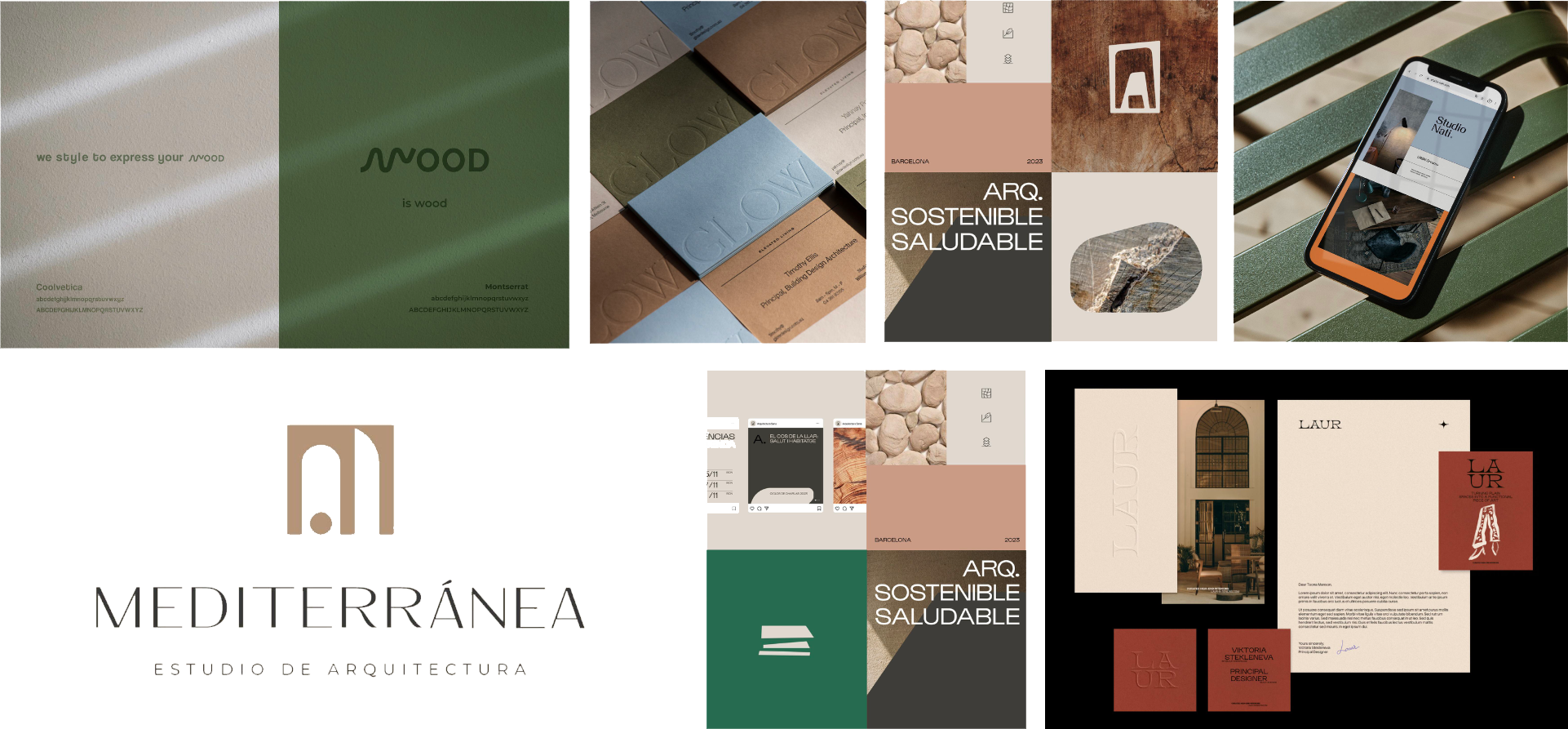
Moodboards
The primary direction behind the logo explorations centered on the letter “S” from Sauce. Its natural curvature and fluid movement became a key visual anchor, symbolizing the organic and dynamic nature of the studio’s design approach.
This gesture reflects the studio’s commitment to creating spaces that move away from rigid, straight lines and instead embrace softness, flow, and adaptability. By framing the “S” within subtle oval and circular forms, the mark balances fluidity with structure — reinforcing a sense of harmony and intention.
The simplicity of the symbol enhances the understated elegance that defines Sauce Estudio’s work. Ultimately, the final logo achieves a balance between organic expression and architectural clarity, aligning with the studio’s mission to create functional, harmonious environments rooted in natural principles.

Proposal 1
This proposal explores the letter “S” as the core visual element of the identity. By placing the letter at the center and surrounding it with a circular arrangement of the studio name, the design creates a sense of rhythm, motion, and continuity, reflecting the fluid and evolving nature of the creative process.
The circular composition reinforces the idea of ideas moving in cycles: exploration, experimentation, and refinement. At the same time, the bold “S” acts as a strong focal point, giving the mark a distinctive and memorable presence.
The minimal structure keeps the identity flexible and adaptable across different formats.

Proposal 2
This proposal takes a more typographic approach, using the wordmark as the primary expression of the brand. The elegant serif letterforms convey sophistication and confidence, positioning the studio as refined while still approachable.
The contrast between the larger “sauce” and the smaller “ESTUDIO” creates a clear hierarchy, allowing the name to stand out while reinforcing the studio’s identity. The typography itself becomes the visual statement, relying on carefully balanced proportions and spacing to communicate clarity and professionalism.
By keeping the design minimal and typography-driven, the logo feels timeless and adaptable across different mediums.

Proposal 3
This is the final proposal and logo selected, built around the letter “S” from Sauce, whose natural curves and fluid motion serve as the core visual gesture. This organic form embodies the studio’s dynamic and adaptive approach, moving away from rigidity toward softness, flow, and spatial harmony.
Encased subtly within oval and circular forms, the mark balances movement with structure, creating a sense of intention and equilibrium. Its simplicity amplifies understated elegance, reflecting Sauce Estudio’s philosophy of designing spaces that are both functional and visually expressive, a version the team fully embraced.


The slogan naturally connects with the word "Sauce" (willow), a tree known for its deep roots and ability to adapt and thrive in various environments. Just as the willow firmly anchors itself in the earth and adjusts to its surroundings, at Sauce Estudio they begin each project by understanding its essence, respecting and addressing the fundamental needs of their clients and the environment. This allows them to design spaces that are authentic, sustainable, and functional.
The metaphor of "the root" highlights the approach of building in a solid and genuine manner, ensuring that each design is grounded in the original vision and the principles of sustainability, quality, and functionality. The slogan not only reflects their work philosophy but also ties into the tree metaphor that represents their name, symbolizing growth, strength, and adaptability.


Social Media


The Instagram highlights for Sauce Estudio are designed to align with the studio’s earthy and natural branding. Each highlight icon features a minimalist and elegant illustration that reflects different aspects of the studio’s work:
Proyectos: The icon shows a stylized drawing tool, representing the studio's creative process and focus on project development.
Renders: This icon includes a 3D render of a space within a square frame, emphasizing the detailed visualization that Sauce Estudio offers.
Maquetas: The final icon features a model structure, highlighting the physical representations of design concepts, which is key to their architectural process.
The use of muted, earthy tones like terracotta, beige, and soft green in the highlight covers reinforces the brand's color palette and connection to nature and organic materials. The clean lines and simplified shapes offer a professional and modern feel, while still maintaining warmth and approachability.
This cohesive design mirrors the brand’s overall aesthetic of balancing nature, sustainability, and functionality in every project.