Freelance | Illustrator, Photoshop, InDesign | 2025
LUNOVA
Lunova is an event production studio focused on creating unique, memorable, and highly personalized experiences. The brand is designed to appeal to a modern, high-end audience seeking exclusivity, creativity, and emotional connection in every detail.
The Challenge
The project began under a different name, Mytikah, which aimed to evoke something mythical and unforgettable. However, early in the process, it became clear that the name was strongly associated with a well-known commercial complex in Mexico, creating potential confusion and limiting the brand’s ability to stand out.
This led redefine the brand name.
Strategy & Concept
The core idea remained centered around creating magical, elevated experiences through emotion, and atmosphere.
This concept evolved into Lunova, a name that blends elegance, while feeling distinctive and minimalist.
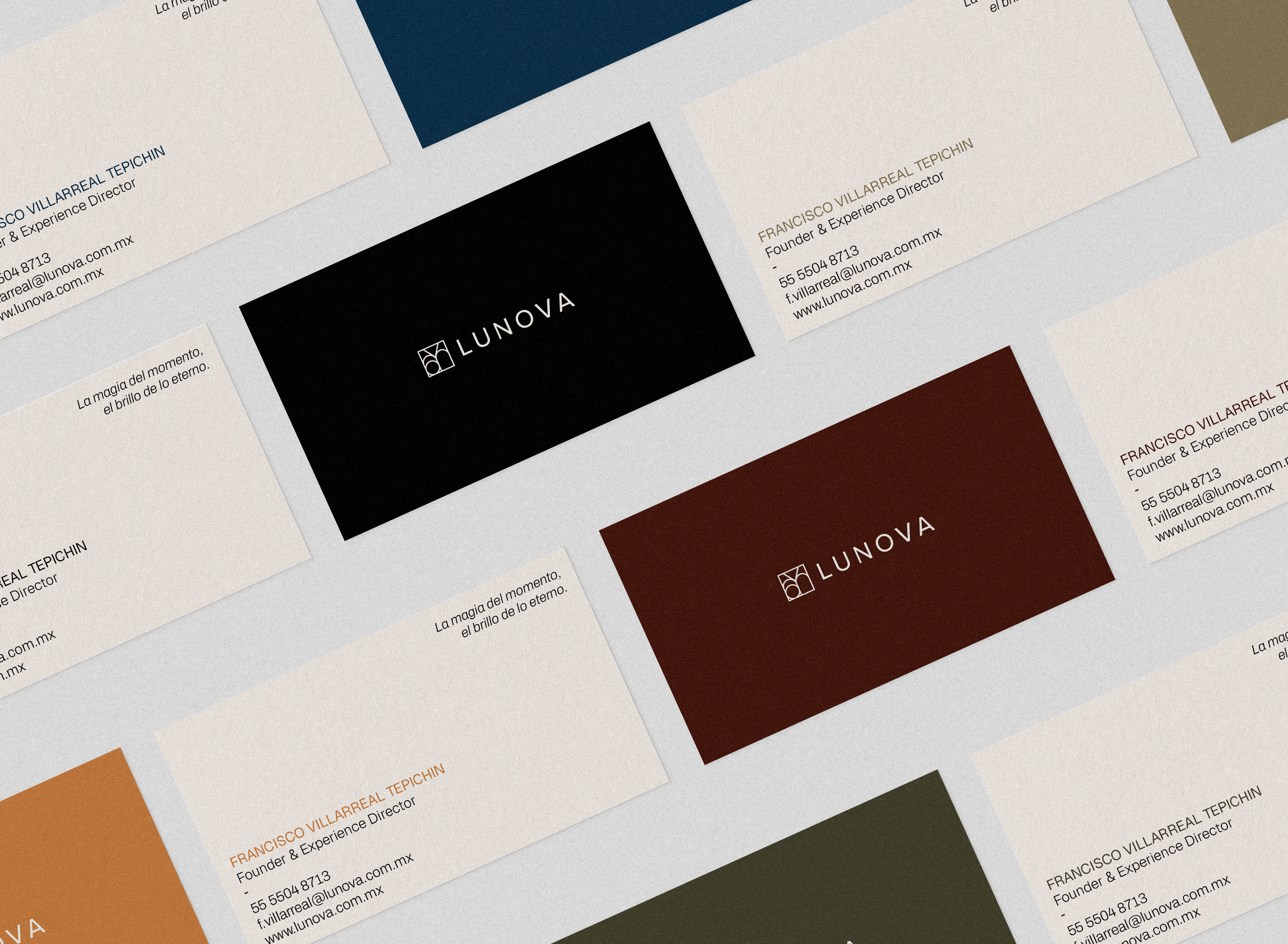
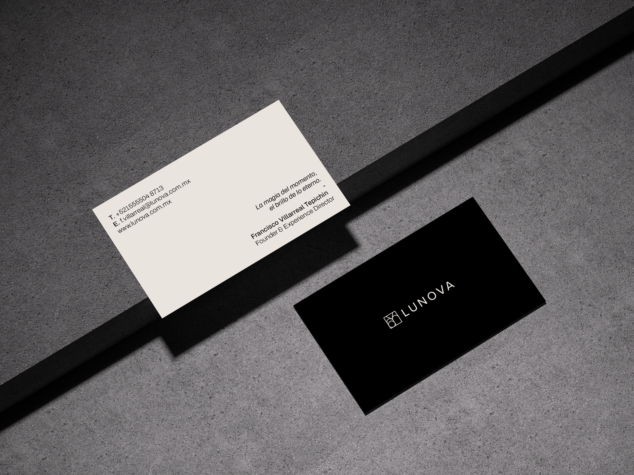
The Lunova logo was designed as a modular line-based system, built on a square structure that reflects balance, clarity, and intention.
Each internal symbol represents one of the brand’s core divisions: Social, Deluxe, Romance, Creative, Kids, and Corporate.
While each symbol can stand independently, they are designed to come together into a unified composition, forming the complete Lunova mark.
This approach allows the identity to be both flexible and cohesive, adapting to different event types while maintaining a strong and recognizable visual language.
Each color represents a distinct identity from the brand; Social, Deluxe, Romance, Creative, Kids, and Corporate.
While remaining part of a cohesive visual system. This approach allows each branch to stand out individually, without losing connection to the overall brand. To maintain clarity and consistency, colors are applied with intention, ensuring proper contrast, legibility, and a refined visual balance across all touchpoints. Each division uses its assigned color as a primary accent, paired with the brand neutral tones, cream and black, to create a sense of elegance and visual harmony.
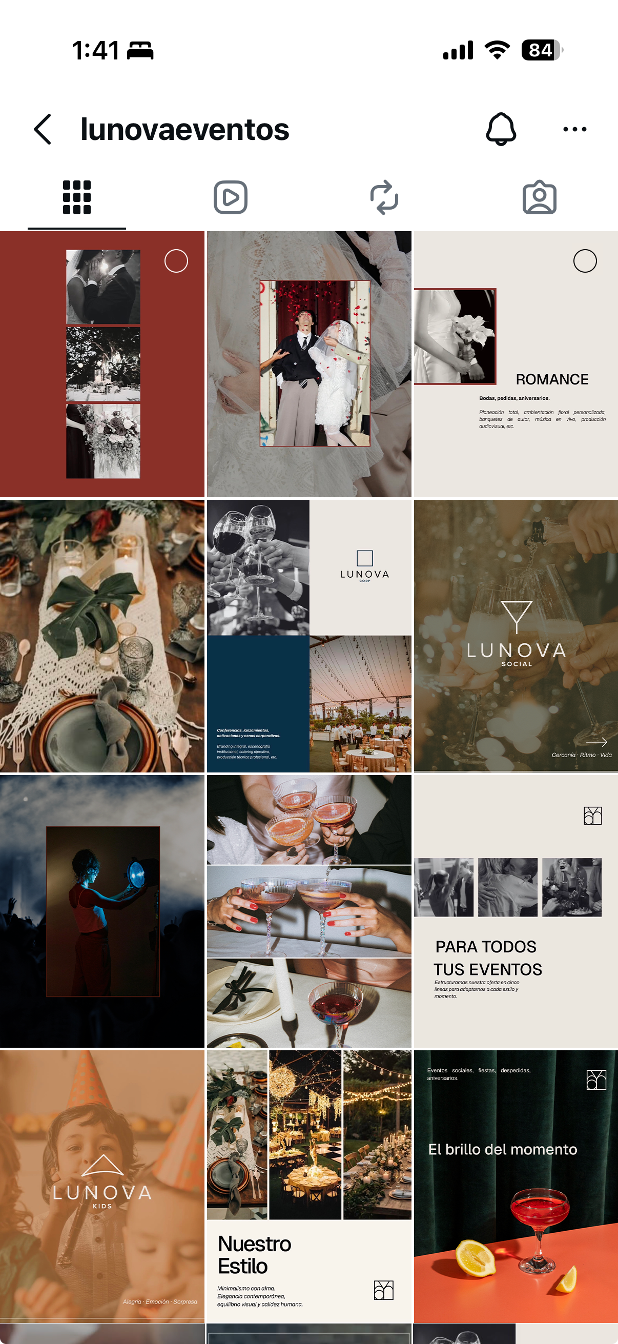
The Instagram feed was designed as a modular system, built from a series of flexible templates that ensure visual consistency while allowing for diverse content across different event categories. Each template is structured to balance imagery, typography, and negative space, throughout the feed.
A key element of the system is the use of color to distinguish each event branch. Every category is assigned a specific color palette, paired with a corresponding symbol that acts as a visual identifier. This approach not only strengthens brand recognition but also makes the content easier to navigate, allowing users to quickly understand the type of event being showcased.
The result is a scalable and intuitive feed that maintains a strong visual identity while adapting seamlessly to different formats, content types, and storytelling needs.